Field notes for real life, not just spec sheets
There’s a quiet truth about phone cases: the material you hold all day shapes more than protection; it shapes how you move through your routines. The edge that grips your palm on a rainy station platform, the way light rolls across a matte back in a meeting, the fingerprint a gloss panel insists on keeping—materials decide these small, daily negotiations. Printing decides the rest: whether a line stays crisp, a gradient stays generous, and a pattern can glide around the corner without breaking character. This guide is a practical companion to help you choose a case you enjoy living with, not just one that survives a fall.
What “feel” means in the hand
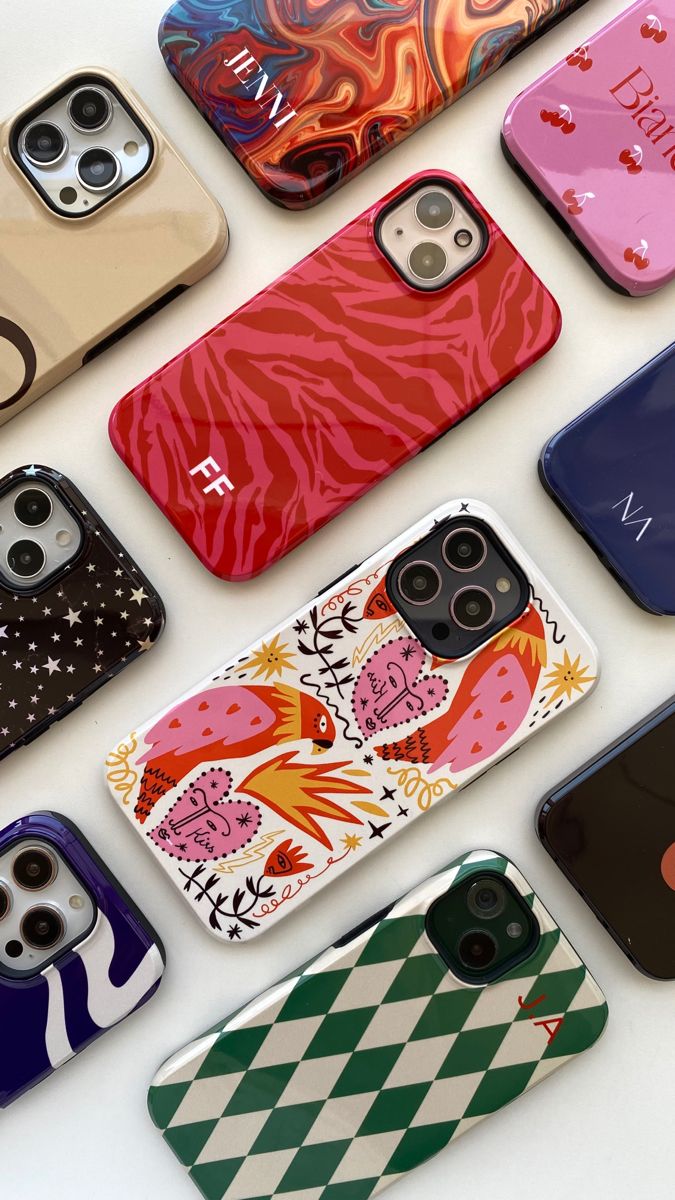
Pick up a flexible TPU case and it answers your grip immediately. TPU has that soft, slightly elastic snap that hugs the device and calms the nerves when you’re stepping off a curb with coffee in one hand and your phone in the other. It damps small shocks well and tends to land light in the pocket. A silicone case is a cousin in spirit—more velvety, a touch more drag on fabric, the kind that stays where you leave it on a smooth table. People who like “warm” textures often find themselves here. On the other end sits polycarbonate (PC), the classic hard‑shell. It’s clean, rigid, great for sharp edges and bold prints, and it slips into a tight pocket without picking a fight; the trade‑off is you rely more on shape and raised lips than squish for protection. Many of us settle into the middle with hybrids—a TPU bumper wrapped around a PC back—because it’s reassuring to feel grip at the edges and see art held taut across a rigid panel. None of these choices are universally better; they’re different kinds of confidence.
What printing actually changes
Printing isn’t decoration tacked on at the end; it’s how the artwork and the substrate shake hands. UV printing lays ink directly onto the surface and cures it into a hard, durable skin. On a PC back it’s wonderfully faithful: fine lines stay disciplined, small type keeps its manners, and you can choose a gloss that sings or a matte that lowers the volume. Sublimation works differently, infusing dyes into a polymer surface with heat and pressure, and that chemistry unlocks something UV can’t: color that wraps. Patterns can flow over curves and edges as if they were planned for it—because they were. Sublimation’s look is deep and seamless, perfect for gradients, textiles, and those all‑over motifs that feel more like fabric than paint. When you ask “Which one is better?” the honest answer is “Better for what?” Choose UV when you care about line discipline, tight logos, and graphic clarity. Choose sublimation when the idea needs to breathe around corners.
Finish, edges, and the small design decisions that matter
Finish is the mood of a surface. Gloss projects—colors pop, reflections amplify the print, and the case photographs like a little billboard; you’ll wipe it a bit more, but many happily trade upkeep for that shine. Matte diffuses light and calms the eye; it looks premium in person and merciful in harsh office overheads. Soft‑touch coatings land between feel and function, adding a suede‑like grip that makes the case a pleasure to pass between hands. Around the perimeter, the details are quiet but important: a raised lip that keeps glass off rough café tables, a camera island with enough height to protect lenses without catching on fabric, a sidewall that doesn’t dig into your palm during long reads. If you’re choosing a wrap print, consider how the motif turns the corner—good wraps treat edges as part of the composition, not an afterthought.
Fit is not a footnote
Modern phone families split into tiny deltas—camera layouts shift, buttons scoot a few millimeters, magnet rings change strength and diameter. “Close enough” isn’t kind to your daily use. Choose the exact device variant, especially around launch seasons when model names rhyme. If you rely on magnetic accessories, check for integrated rings or alignment guides instead of assuming any thin case will do. Good fit is invisible; bad fit is all you notice.
Choosing by lifestyle, not just by spec
If you commute, text one‑handed on trains, and live in weather, a hybrid with a matte UV print is a forgiving partner—grippy edges, crisp art, and a back that doesn’t become a mirror under station lights. If you’re design‑first and love that gallery‑poster pop, a hard PC case with gloss UV makes color feel present even in low light. If patterns and textiles are your language, sublimation on a wrap‑friendly shell creates that continuous, fabric‑like look, perfect for botanicals, checks, and gradients that bloom across the sides. Minimalists often prefer a soft‑touch TPU or silicone where the pleasure is tactile and private; the color reads quiet in public and comforting in the hand. Gift‑givers do well with matte finishes that photograph beautifully on first unboxings and in the week that follows.
How cases age—and how to help them
Surface behavior over time is more about use than myth. Gloss panels carry fingerprints but resist scuffs; matte hides prints but will pick up “life marks” if you toss your phone onto mineral countertops. Light‑colored elastomers can slowly adopt the world’s dyes (dark denim is a usual suspect) and appreciate a gentle wipe after long contact. The simplest care routine is the best: a microfiber cloth, a little water, avoid harsh solvents, and don’t drag corners across rough concrete when you can help it. Durable prints don’t mind being used; they mind being sanded by accident.
An honest note on sustainability
On‑demand production, the way we run it at iuufu, side‑steps overstock and the sad math of clearance bins. That helps. Materials and shipping still have footprints, and pretending otherwise only moves the problem out of frame. What we can do—and do daily—is build for longer use with prints that last, recommend finishes that age gracefully for your lifestyle, pack with less waste, and route production closer to you when possible. Sustainability isn’t a badge we pin on a product card; it’s a set of decisions we revisit every time we publish a new piece.
How we make prints feel like they belong
Before art reaches your cart, our team maps it to templates, checks color and scale against real devices, and decides which method—UV or sublimation—serves the work rather than forcing it. We test edges, we nudge motifs away from camera cutouts, and we choose finishes that let the idea keep its voice under everyday light. It’s not magic; it’s simply taking the time to let the material and the image agree.
A calm way to shop
Start with feel—do you want grip you notice or a surface that disappears? Then look at the idea—does your artwork need line clarity or a wrap that breathes? From there, color becomes simple: gloss if you love presence, matte if you love quiet. If you get stuck, use our Lookbook sets as a shortcut; they’re designer‑paired combinations that behave well together in real rooms and real bags. And if you’ve already found a creator you love, browse by their collection and trust your eye. The case you carry most is the one that feels right before you press “Buy.”
Explore by device: /collections/phone-cases
Shop designer‑paired sets: /pages/lookbook