Not louder, just more together
Prologue — the difference between matching and belonging
Most “matching” is loud and short‑lived: the same print shouted across everything until the room gives up. Designers aim for something quieter and longer—objects that belong together without begging for attention. At iuufu, sets are built the way editors assemble an outfit: one piece speaks, the others steady the scene, and the whole arrangement looks inevitable in real light. The trick isn’t mystery; it’s proportion, rhythm, and a handful of calm decisions repeated well.
The base and the accent
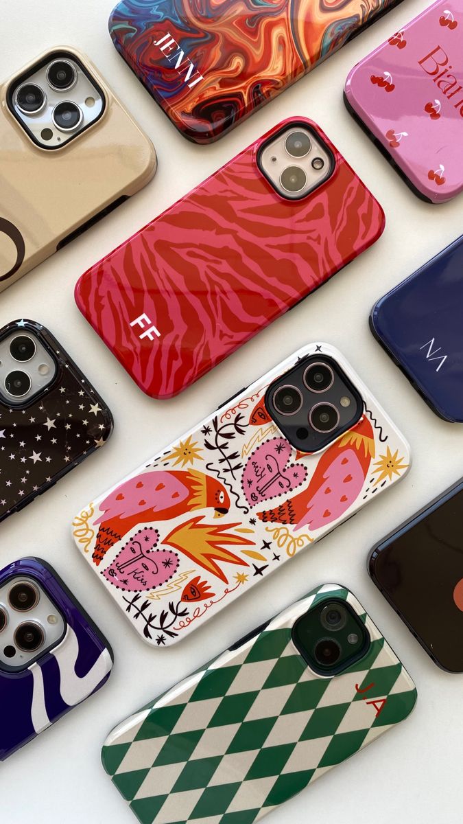
A set begins with a base—the piece that keeps time. In our world, the base is often the tote or the desk mat: surfaces with responsibilities. They carry weight and live in difficult light, so their pattern behaves like texture rather than announcement. Once the base is honest, the accent chooses itself. Phone cases make good accents; they’re small, held close, and allowed to be clear. We let one pattern say the name of the set while the others say the sentence around it. When you see a case in petal‑pink and a mat in quieter moss, it isn’t an accident; it’s a conversation about scale and tone.
Pattern pairing fails most often on scale. A field of tiny flowers beside a dense mini‑check turns into static; two oversized prints feel like a duet without a key. Designers mix scales on purpose: a medium print earns the spotlight, a small pattern supports it like grain, and a broad area of near‑solid color becomes a place to breathe. Rhythm comes from repetition with mercy—enough echo to read as a family, enough rest to avoid fatigue. That rest is not emptiness; it’s deliberate negative space where the eye can reset before meeting the motif again.
Color bridges that hold in daylight
Screens flatter; daylight votes. We choose color as bridges, not as badges: a blue thread that runs through three pieces at different volumes, or a warm/ cool handshake that lets a floral and a geometric share the same table. Temperature does more work than saturation. A coral accent that looked perfect at midnight may feel theatrical at 10 a.m.; soften the base, keep the accent honest, and the set will survive the commute. The goal is continuity you notice only when you remove a piece and the balance falls apart.
Finish is not glamour; it’s behavior. Gloss makes color present and cameras generous; it can turn a case into a small poster. Matte diffuses office overheads and steadies print; it belongs on mats and totes that spend time in public light. Soft‑touch earns its place when the story is tactile. In a single set, we let finishes support roles: the accent can sing a little brighter; the base keeps its voice low. Design survives because light has been considered, not ignored.

Edges, alignment, and the quiet craft
Sets are lost at the edges—where a pattern meets a seam, a camera cut‑out, or a mug’s handle. We treat edges like punctuation. Wrap prints are composed to turn corners without breaking character; motifs are nudged off lens islands instead of sacrificed to them; signatures land where a palm won’t rub them pale. None of this shows up in a hero shot, which is exactly why it matters. Craft is the part of design that works when nobody is looking.
Before a set goes live, we test it in rooms that don’t care about us: a desk under cold LED strips, a sofa that swallows color, a kitchen table with afternoon glare. If the group still feels obvious and kind—if the case remains the accent, the tote holds the palette, and the mat settles the scene—we keep it. If not, we remove the clever part and try again. Matching on a grid is easy; belonging in a room is the job.
Three small stories
There’s a spring Bloom Set that behaves like a window opened one notch. The case wears a clear floral in petal‑pink; the tote stays natural with a slight weave; the mat carries a micro‑pattern of leaves so small it reads as calm. People tell us their desks feel finished, not decorated.
There’s an Ocean Set that keeps offices from feeling stale: a seafoam gradient on the mat, a charcoal tote with a single stitched line, and a case that holds coral like a note you hum rather than perform. The colors do not compete; they agree.
And when a room wants structure, a Neon Grid combination pairs a deep‑blue abstract on the case with a graphite tote and a desk mat whose grid glows just enough to feel intentional. The photographs look clean; the daily use looks calmer than the photographs.
Start with the piece that has the hardest job—usually the mat or tote. Choose a pattern that reads as texture in your lighting. Let the case be the sentence that names the set. Build a bridge color you can repeat once softly. When in doubt, remove an idea instead of adding one; the space you free becomes your style. Our Lookbook does this work for you if you’d like a shortcut, but the rule remains: not louder, just more together.
Explore designer‑paired sets: /pages/lookbook · Shop by creator: /collections